Project Overview
Design a mobile app and responsive website for a local bakery that enables users to view menu options and place online orders.
The Design Prompt:
How can we: reduce wait times for placing & receiving bakery orders and enhance the overall ordering experience by improving menu readability and efficiency.
The Problem:
The Product:
A digital multi-platform experience was designed for a local Arizona bakery called Prickly Pear Pastries. It allows customers to easily view menu options and quickly place bakery orders from a mobile app or online responsive website.
Project Duration:
7 Weeks (May - July 2024)
Role:
UX Designer
Apply design thinking principles from Google’s UX Design Certification
Learn how to utilize Figma as a design tool for creating positive user experiences
Create a consistent user experience across multiple platforms
Goals:
User Research
User research was gathered from a sample collection of 8 individuals who were interviewed prior to the start of this project. Using the information and data collected from analyzing these interviews, common user findings, experiences, and pain points were identified to understand the scope of the problem.
Summary:
Academic Obligations: Users are currently engaged in academic pursuits or responsibilities that take time away with their ability to solve the problem.
Language Barriers: Users are not from the United States or come from non-English speaking backgrounds, creating language barriers.
Vision Difficulties: Users have visual impairments that may limit their ability to solve the problem
Work/Family Responsibilities: Users either work full-time or have familial obligations that impact their success with solving the problem
User Pain Points:
User Personas
Maria is a foreign exchange student who needs a quick and efficient way to order food because it takes time away from her studies.
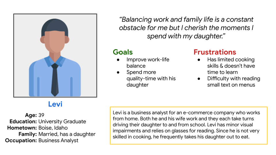
As a working parent, Levi needs a simpler way to read and order from a menu, allowing him to spend more quality time with his daughter when eating out.
User Journey Maps
My goal in creating these user journey maps was to empathize with the personas and understand the challenges they face.
As a full-time college student studying in another country, what obstacles might they need to overcome in their daily schedule?
What challenges does a full-time working parent face when balancing a professional career with raising children?
Ideate/Prototype: Mobile App Design
For my first UX design project, I spent time getting comfortable with sketching wireframes for mobile devices. To design the home screen layout, I created several variations to generate ideas.
Sketching Wireframes
Navigation & Shopping Cart Icon.
New Order CTA button
Browse Menu Tab
Home Screen
Key Features:
The First Impression…
The home screen is the first thing that users see when opening the app. It should serve as the digital hub for the app, allowing users to navigate to different features from there.
From Wireframe to Prototype
Left to Right: Navigation, Home Screen, Menu, View Shopping Cart, Schedule Order, Checkout, Order Confirmation Screen
User testing was conducted with the prototype to identify usability problems with the early prototype and to ensure that the product remains user-centered. It also served to validate that design decisions aligned with user needs.
User Testing
Menu Screen
Design Iterations:
During user testing, participants expressed a desire to order items in multiple quantities. As a result, an item quantity feature was implemented.
Schedule Order Screen
Optimizing UI Layout:
To streamline the app ordering process, the schedule order screen was compartmentalized to display only relevant information based on order types.
After iterating on the early prototype, an interactive prototype was created to simulate the experience of the final product.
Try it out yourself: Interactive Prototype
Interactive Prototype
Ideate/Prototype: Responsive Web Design
While creating the sitemap I opted for a blend of a hierarchical and sequential site structure. The hierarchical structure was used for accessing different aspects of the website. The sequential structure was used for the online ordering process.
Organizing Information Architecture
I already had a concept in mind for the checkout process, so I focused primarily on the homepage and menu viewing screens. I drafted several homepage ideas and menu layouts for different screen sizes.
Sketching for Screen Size Variation
Designing for Desktops
Left to Right: Homepage, Menu, View Shopping Cart, Checkout, Order Confirmation Screen
Responsive Design
My goal in creating screen size variations was to ensure that smaller screens have the same level of functionality as larger desktop screens.
For the responsive website design, an unmoderated study was conducted with 3 different participants that ranged from 10-15 minutes. This helped me identify some critical usability flaws with the initial web design.
Usability Study
One of the more pressing findings was that users struggled to proceed to checkout because they couldn't find the checkout button. To resolve this issue, an additional button with greater clarity was added.
Users noted that the order form on the checkout page was sometimes disorganized and contained unnecessary elements depending on the circumstances. The checkout page was reorganized to ensure a user-friendly checkout experience.
After making design iterations following the Usability Study, an interactive web prototype was created to simulate the ordering experience of the final product.
Try it out yourself:
Web Design Prototype
Project Takeaways
This design project enabled me to create a digital multi-platform experience that allowed users to quickly and efficiently place orders from a local Arizona bakery.
Project Impact:
Looking back, I believe one of the weaker points in this case study was the user research. Since user information was obtained before the project and I was uninvolved in that process, there may have been some potential oversights in the insights and conclusions I drew from the provided information. Going forward, I should improve my user research data collection methods.
I applied UX design principles taught from previous UX courses and utilized Figma as a design tool for creating a consistent user experience across multiple devices.


